Let me preface this by revealing that I am an avid online shopper. There are at least three parcels arriving swiftly at my door every week (because I pay for annual next-day delivery from a number of retailers) – I’m well placed as a marketer, and a consumer, to make recommendations when it comes to ecommerce websites.
I know what I like, and I know what turns me off when it comes to making purchases online. What do I like? Instant payment options, speedy websites, images that provide context, clear returns policies and pop-ups with discount codes.
What do I dislike? Having to leave the comfort of my sofa to find my card details, long checkout processes, zero customer reviews and no readily available purchasing incentives.
But enough about me.
Christmas is a time for giving.
In the world of e-commerce, it is also a time for sales, a time for profit and a time to really ramp up ecommerce tactics that will provide revenue increase long past the yuletide.
In this blog I’m going to provide you with an array of actionable insights that will see you:
- Increase sales
- Make numerous changes to product pages
- Reduce cart abandonment and bounce rate
- Vastly improve your checkout experience
- Identify areas to increase conversions at each stage of the buyer journey
- Use website copy to your advantage
- Increase ROI from ad spend
Merry Christmas!
Product pages
Your product pages should have one glaring objective – to convert the user. Over the next few pages we are going to share some of the elements that should be introduced to increase the current conversion rate of your ecommerce site.
Product information
Think like a consumer and make the purchasing decision easy. Providing key information such as:
- Price
- Descriptions
- Discounts & offers
- Payment options
- Shipping & delivery details
- Returns options & policy
- Stock availability
- Variants in colours or sizes
- Care or build instructions
- Product details such as materials or ingredients
- Related items
Product images and videos
There is science behind the adage ‘a picture tells a thousand words’ – our brains process images 60,000 times faster than words – this puts into perspective just how important product images are. In fact research found that 87.6% of online shoppers state that clear product images are a significant factor when it comes to a great shopping experience.
Instead of uploading one uninspiring product image, leverage the value of photography and videography and see an uplift in revenue as a result.
Here is our advice:
- There should be a variety of photos from different angles, close-ups of details and photos in context, someone wearing, using or enjoying the product.
- Photos should be of high quality, but also compressed as not to hinder site speed.
- Include video or a 360-spin image where possible.
Product descriptions
Who even reads a product description, right?
WRONG. An ecommerce study found that 20% of unsuccessful purchases are down to a lack of relevant information in online product descriptions.
Your product description, like most marketing copy, should start with a great understanding of your audience, and some all-important keyword research – put yourself in your audiences’ shoes and right for THEM.
Once you understand the language they are using and what they want to know, you can weave this into a compelling description, free of bland phrases that provides users with all of the important benefits and features of your product that moves users to purchase.
How will your product make their lives easier, more enjoyable, or comfortable?
Use these questions to create a template:
- Who is your ideal customer?
- What are the key features of your product?
- When, how or where is the product best used or enjoyed?
- What makes your product unique?
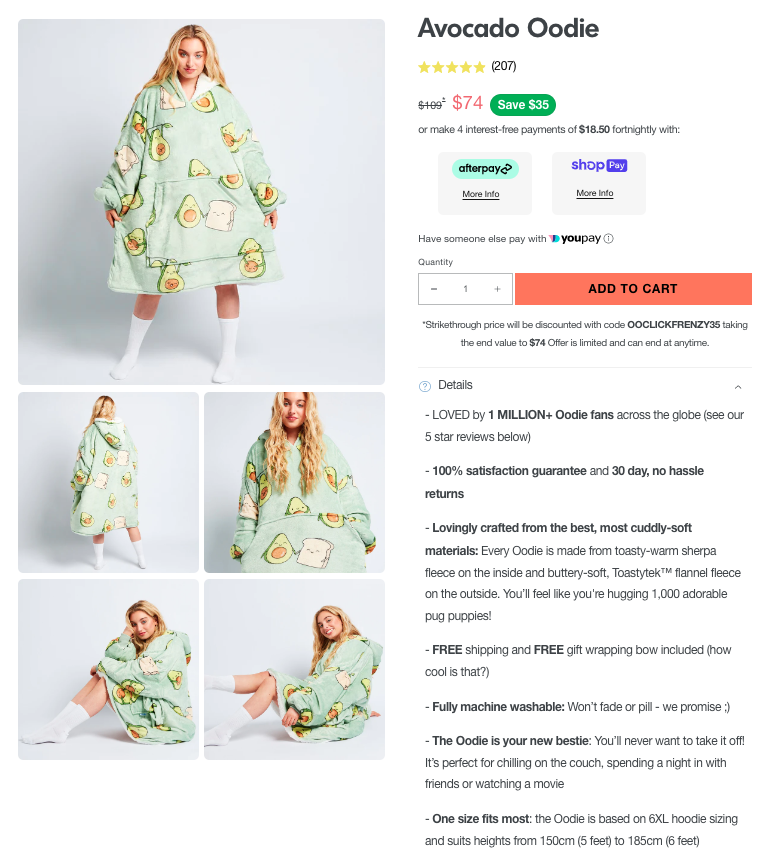
Online retailer Oodie is a great example of writing compelling product descriptions that are well aligned with its audience.
FAQs
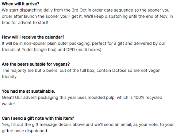
FAQs should provide extra detail that is of value to the user but doesn’t belong in the product description. Questions around delivery, packaging and more niche questions that are important to your audiences’ values and interest.
FAQs should be driven by sales and customer service teams, mixed with a little bit of keyword research, that heavily influence users that are further down the funnel, teetering on the edge of making a purchase.
Reviews & testimonials
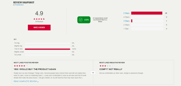
Social proof, real world signals, tribalism – whatever language you choose to use, customer reviews strengthen credibility, instil trust in new users and influence consumer decisions.
The online equivalent of ‘word of mouth’, websites that leverage customer reviews and user generated content can expect around an 18% uplift in sales as a result, according to research from Dixa.
Be choosy when it comes to the review platform that you use to prevent false reviews being left – opt for a solution that integrates with your payment system.
If you are leaning into social media and creating a community of brand advocates that share images of your products – be sure to maximise this and embed your social feed into your website, to curate a never-ending feed of beautiful images that provide social proof to prospective buyers.
Technical Elements
Let’s get technical…
Mobile-first
To drive customers, you must think like a customer. Mobile-first is so important – more than 70% of worldwide consumers are making their purchases using a mobile device.
Insider Intelligence reported that mcommerce sales increased by 15.2% in 2021 (vs 2020), and will account for 44% of all ecommerce sales and Business Insider has predicted that the value of mobile-commerce will increase to $418.9 billion by 2024.
If you haven’t already then you should be investing in your mobile-first ecommerce store. Mobile first means designing and building a website for smartphones before it is scaled up for desktops and laptops.
This IS NOT the same as mobile-friendly, that uses the traditional approach that is the opposite of the above. Building for desktop, then scaling down for mobile often means the website and shopping experience is compromised.
Building a mobile-first ecommerce store means you are catering for your audience and future-proofing your business, brand and let’s be honest – bottom line.
50% of customers will stop visiting a website if it isn’t providing a great mobile experience.
Speed
Time literally is money.
Site speed is directly linked to the conversion rate of your website, as well as the organic performance of your websites.
Google has reported that 53% of mobile users will leave a website if the load time is two seconds or longer, and conversion rate can increase by as much as 27% from a one-second improvement in site speed.
Here is our 2-step process for site speed success:
- Audit your current site speed
- Make improvements
Choose an ecommerce hosting provider focussed on improving and maintaining site speed.
Optimise images by running through an image compressor and use the right file format – JPEGS use less space than PNG files.
Host videos off-site and embed them instead.
Stop using image carousels and sliders – little impact on conversion rates and slow sites down.
Use lazy loading – done with Javascript, it downloads images based on how users are looking at the page.
Minimise the number of third-party plug ins being used on your website – another reason your site might be slowing down.
Make sure you are using the latest PHP version – each new version means the programming language improves in speed, stability, security and performance. (Be sure that your website and database is backed up when changing PHP versions.)
Categorisation
Your website architecture is critical to its success, and revenue it generates. Categorisation is the grouping of products into clear and hierarchical categories, and is key in user experience and conversion rate, but also in the way your website is ranked, and ultimately – the volume of organic traffic that is driven.
Women’s clothing
Footwear
- Boots
- Flats
- Heels
Jackets
- Leather jackets
- Aviator jackets
- Teddy jackets
Bags
- Backpacks
- Clutch bags
- Shoulder bags
You can categorise your products in a number of ways, ideally, the most commercially valuable products would be higher up in the site architecture.
Mega menus are popular with many ecommerce websites because they are an effective way to both top-level and sub-level category pages clearly to users.
To leverage the benefits of SEO, it’s important to align your navigation labels, URLs, headings and meta data with keyword data.
A logical URL structure should look something like this:
www.amyswebsite.co.uk/womensclothing/footwear/boots/westernboots
www.amyswebsite.co.uk/womensclothing/jackets/leatherjackets
While a meta title might look something like this:
Women’s Western Boots | Women’s Boots | Amy’s Website
We recommend conducting an audit of all of the H1’s, meta data and URL’s on your website and ensure they are technically sound and keyword aligned.
Schema
Schema markup is specific code that aids Google to find and understand what is on each page of your website, improving SEO – giving you the competitive edge. There are a number of SCHEMA variations that can be used for an ecommerce website.
Homepage:
Organisation schema
Breadcrumb schema
Category pages:
Item List schema
Product pages:
Product schema
Review schema
Blog & guide content:
Article schema
How-to schema
FAQ schema
Intent matching
Understanding user search intent can be a game changer when it comes to ecommerce SEO, and can work for both external and internal site searches, because it will help you optimise your pages for the type of search.
In its most simple form – user intent is WHY the user made that search, what kind of results are they looking for? They are split up into the following categories:
Informational
Information gathering, this intent makes up a large volume of search queries – but can often return results that don’t quite hit the mark.
“How to”
“Why is”
“*** recipes”
“Directions to ***”
Commercial
The early stages of product investigation and research, and intent of someone looking for information that helps them make a decision.
“Best winter jackets for children”
“Best hairdresser in Cambridge”
“Brewdog vs Tiny Rebel”
Transactional
These searches often just include product or brand names, or product descriptions like colours or styles, or searches for deals and discounts.
They are high intent, made by people that are ready to buy.
“All Saints Dresses”
“Pink Cashmere Scarf”
“Gluten Free Luxury Hamper”
“JD Sports Discount Code”
Navigational
Often a brand, business or premises name only, ie: Facebook, H&M, Alton Towers, navigational searches are used by those wanting to get to a direct website – either one they use frequently, want specific information from or a brand they want to buy from.
Once you understand just how (and why) your audience are searching and the results they are looking for, you can create the content and optimise your website to meet the intent.
For example:
Informational – Blogs, Youtube videos – ‘5 ways to style a women’s padded winter jacket’
Commercial – Buying guides, ’10 of the best winter jackets for outdoor lovers’
Transactional – Ensure product pages are optimised for these searches through meta data, titles, content, reviews and schema
Navigational – Prime your site for those who are ready to buy with product retargeting or personalised pop-ups and email offers for people returning to your site by using cookies and email data.
Conversion rate optimisation
As well as the insights we’ve provided so far in this guide – there are also a number of elements that can be implemented site wide.
Live chat
Nearly 50% of ecommerce customers expect a live chat option on your website. We live in the age of instant, and have become accustomed to having the information we desire at our fingertips.
It’s unlikely that all ecommerce stores have the budgets for AI chatbots right now, but there are ways to make the option work for you. Having a designated person to respond during working hours, and a personalised message out of hours that explains your working hours and response SLA is the perfect way to manage expectations.
There are a number of options to choose from including:
Facebook Messenger
HubSpot
Tawk.To
Or live video chat solutions like Service Bell.
Call -To-Actions
Call to actions or CTA are not the one-dimensional buttons they are often thought to be. Yes, wording is important, but so is the size, colour, placement.
Size
Apple recommend CTA buttons in mobile UI should be at least 44×44 pixels, while Microsoft recommends 34×26 pixels.
Colour
The psychology behind colour is a fascinating topic and there are many theories behind how colour can impact action and conversions. Best practice is to use contrasting colours to ensure the CTA stands out.
Each business and audience are unique. Our best recommendation is to test what drives the best results through conversions and ROI for your business. By making one change for a determined amount of time, you can measure the impact of each decision and the elements that your audience responds to best.
Pop-ups
No, not annoying, intrusive – but well-timed, strategic pop-ups with messages that take a user to a customer, or a customer to a return customer. Instead of turning off your customers – pop-ups can help increase conversion by as much as 44%.
Use cases include:
- Discounts – in exchange for leaving an email address
- Flash sales – as exit intent incentives
- Product bundles – during the checkout process
- Scarcity for popular/seasonal products – on product pages
- Delivery information – for items sitting in a cart
- Engagement – for returning customers who abandoned their cart
The Checkout Process
Research from Statista found that when shoppers abandon carts, less than 30% return to purchase the items. In fact, 25% buy the products from a competitor.
Your checkout process should be quick, simple and pain free to create the path of least resistance and maximise sales potential when it comes to purchasing.
Payment options
Please, please, please – consider instant payment options – PayPal is not enough. We understand that there may be a cost involved to have options such as Klarna, ClearPay Apple or Google Pay added to your website – but this really should be considered an investment rather than a cost – especially if you are running product ads.
By implementing these options in your website, you are enabling customers to purchase instantly, impulsively and create a great shopping experience for them – more important than ever during the busy build up to Christmas.
Happy customers are year-long return customers after all.
Abandon Cart
Data from Baymard Institute shows that just shy of 70% of online shopping carts are abandoned – so for every 10 carts – seven leave without purchasing.
This is an opportunity if ever we saw one.
To find your cart abandonment rate you can divide the total number of completed transactions by the number ‘adds to basket’.
Then subtract one from the other and multiply by 100.
If you really want some perspective (and an incentive), use your average order value to determine what the value of lost sales are.
Some of the key reasons for cart abandonment are:
Mandatory account creation
This can feel like a step too far, especially if this is a brand-new customer or a truly one-time purchase.
Long and unnecessary checkout process
Shopping cart > billing information > shipping information > shipping method > order preview > payment > order confirmation.
At each stage, let the buyer know how many more are left to maintain engagement.
The above is a logical checkout process, if you can streamline this further by auto populating or provide an option to use billing address and shipping address – even better. Seriously consider what you deem to be required information, as asking too much at checkout stage will deter buyers.
Shipping costs
Be transparent from the off – perhaps even at product page stage, or at the minimum, once they have provided you with their location information – there is nothing worse than unexpected high shipping costs.
It also helps to put your customer in control and provide options.
Upselling
Once your customer has added an item to their cart – there is an opportunity to increase the potential for more sales.
It costs a business five times more to acquire a new customer than upsell to an existing one, so it makes sense to maximise the potential for every sale once a customer decides to purchase from you.
These upsells can be added once an item is added, using a pop-up that features related products or a ‘customers also buy’ message, that can also reappear during the checkout process.
Urgent actions:
- Add ‘checkout as guest’ option
- Install Apple & Google Pay, even Klarna payment options
- Streamline your checkout process – remove unnecessary steps or fields and see where information can be auto-populated
- Be transparent about shipping costs and time frames
Scarcity & Urgency
Nothing helps the decision-making progress like establishing a sense of urgency with scarcity – if they don’t act soon, they may miss out on securing the product. Whether that’s sharing the stock volume available, or running a limited time offer, a report by Experian found that using scarcity doubled rates of transaction.
When it comes to using visuals such as timers or stock volumes dropping – the realisation of consequence becomes stronger. An A/B test ran by an eCommerce agency in the Netherlands found that the presence of a timer visual created an 8.6% uplift in conversions.
Scarcity and urgency can also be used in email campaigns – by using urgency in subject lines, the same Experian report found that sales driven from email increased by 16%.
Urgent actions:
- Use visuals such as timers for ‘limited time’ offers or sales or stock levels on website pages
- Run email campaigns that use urgent and scarcity messaging in the subject line
- Use visuals and scarcity messaging in product remarketing campaigns
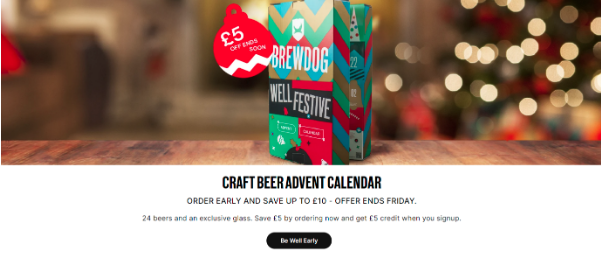
Example: Online global marketplace Etsy allows sellers to add stock volume messaging on their listings, once stock drops to a predetermined level, the notice below is triggered.
Advertising & Promotions
If ever there was a time for heavy promotion, it’s when shoppers are really in a mood to buy, and there are a number of great ways for ecommerce websites to promote themselves beyond organic traffic and social media.
Google shopping Ads
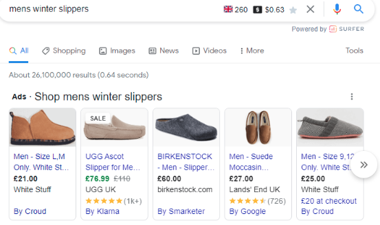
When it comes to getting bang for your buck, Google Shopping Ads are a great choice, often receiving a higher click-through rate than search ads and driving better ROI.
These ads are seen by people further down the funnel, conducting those transactional searches we spoke about earlier – a great image, along with price and brand information could be all they need to make a purchase.
Retargeting
A highly effective form of promotion – data from DataXu (now Roku) found that conversion rates from retargeting can increase by as much as 150%.
Product retargeting, or remarketing, allows you to essentially ‘follow’ your customers as they peruse other websites, with very specific ads – often at a product level.
Here is an example: I have recently been looking at trainers for my daughter for Christmas, on Schuh, as well as other websites – yet Schuh are reminding me, every day that they sell the trainers I was looking at.
There are a number of ways that retargeting can be implemented:
Static remarketing- the standard practice of following your audience with static banner ads using cookies.
Dynamic remarketing – where you display ads at product level that a customer or potential customer has visited. This time, a banner is displayed that contains the products from the pages they have visited. (See my example).

Remarketing lists for search ads – Here, keyword searches are used as the basis for remarketing. For example, you could use a keyword like ‘Gift hampers in London’, so, as someone searches these keywords, they are served with your retargeting ads.
Customer match remarketing – Using a list of your customer emails, they will see your ads – once they are signed into say, their Gmail account. This is a huge opportunity in the lead up to busy periods, to remind them you are here, and ready to meet their demand.
Social Advertising
It’s highly likely that your audience are among the 4.48 billon people using social media – so it makes sense to target them here.
Our Head of Social, Alix, highly recommends that you serve paid ads on social, alongside a consistently updated social feed (3-4 posts per week, per platform), because they can both feed off the success of the other.
First off – you need to know which channel is being heavily used by your audience to make sure you are going to yield an ROI through conversions, rather than people purely seeing your ad.
Email marketing
Email marketing is perfect for ecommerce businesses, and can be utilised in a number of ways in the lead up to a busy selling season. However, it should be used with a firm plan in place to make sure your messages are strategic from both a copy, and a timing perspective.
For instance – a first touch email could be reintroducing your business and team to your audience, referring the pending holiday and how you are best placed to be the retailer of choice.
Perhaps you could include details of any offers that may be running, as well as last order dates to guarantee delivery.
Follow-up emails could include: gift guides, most popular products, new releases, countdowns, flash sales, discount codes, any PR features such as press cuttings or influencer campaigns, delivery reminders, holiday wishes and perhaps even details of a post-Christmas January sale.
By segmenting your email data, you can ensure that you can offer personalised messaging and offers and develop an understanding of your most commercially valuable audience segment.
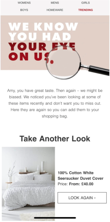
Don’t let them get away…using email address data of previous customers that return to your site, you can email them directly with a ‘don’t forget’ message.
Our recommendation? Invest in series of professionally designed email templates and a scheduling platform that allows you to plan and schedule in advance, leaving you to focus on other areas of your business – and enjoy the festive season!
We hope you found this guide useful, and would love to hear any feedback, or questions you might have.
You can find me on the below:
- amy@mediamattersagency.co.uk
- Or you can get in touch with us directly!

